Showing posts with label design. Show all posts

Herringbone Subway Tile


Plain, horizontal, white subway tile is becoming a "classic look" now that seems to be a staple in most remodels. We have it in our kitchen and bathroom currently (we rent) and it gives a clean, new look to the space. Lately though I've been loving the look of placing the tiles in a different way or using different grouting or colors for the tiles. My parent's just redid their kitchen with a matte black subway tile which still looks classic but brings a fun element to the kitchen. Herringbone placement of the tiles is also one of my favorites. What do you think? Stick with the classic or do something unique?


(Image 1, Image 2Image 3)

Vote for Iron Curtain Press!


Congratulations to our good friend (and blog designer!) Rosanna and her company Iron Curtain Press for being nominated for Martha Stewart American Made. I'm so glad to see their hard work and beautiful letterpress be recognized. The next step of course, is winning and that's where we come in. You can vote up to 6 times a day for Iron Curtain Press. The grand prize is $10,000 to grow your business. 


Wallpaper in Unusual Places

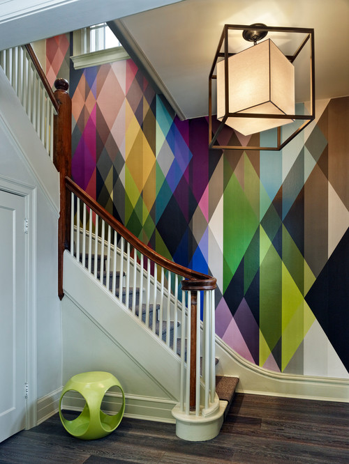
Would you ever use wallpaper? I love the look of it but am intimidated by actually putting it up and trying to match it to the patterns of my textiles and wall hangings. Here are some unusual uses of it that are inspiring me right now.  Maybe when I own my a house I will get braver!

On the stairs 
Staircase (LOVE THIS)
On the ceiling - wow
Ceiling in a children's room 
In a bookcase 
Above tile in a bathroom


Life Size Dollhouse in Grand Central Station

Apparently Target is hosting life size dollhouse in Grand Central Station for two days this week! What a creative idea. Click through this link if you want to see more pictures.

PS. Did you see the dresses from last night's Met Ball? The theme was punk so there were some pretty crazy looks!

Crazy Tips to Make Life Easier

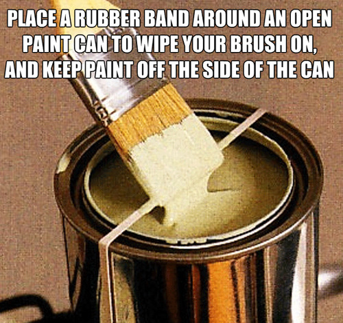
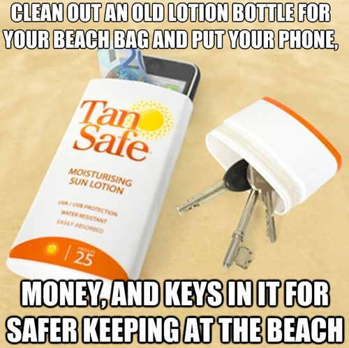
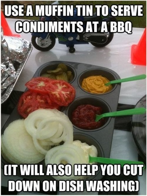
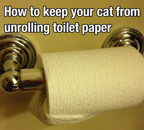
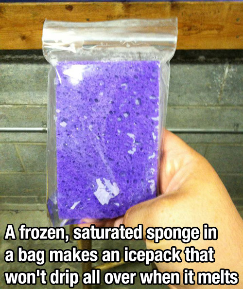
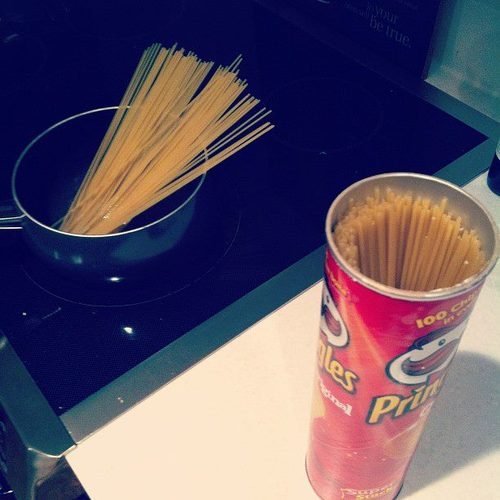
A friend of mine posted this Tumblr on Facebook the other day and it definitely needs to be shared: 99 Life Hacks to Make Your Life Easier! I've pasted a few of my favorites below, definitely using the paint can one this weekend when we paint the nursery (!).


Tiny House Movement

Our feature last week on Jenna and Phil's garden cottage got me thinking about small spaces and I ran across something called the Tiny House Movement. Have you heard of it? From what I've read it's a social movement to simplify and live in a downsized small space. The average American home is 2600 square feet while the typical tiny house is only about 400 square feet. It is an interesting way to save money, create a "green" lifestyle, and simplify overly complicated lives. Aren't these photos fascinating and inspiring? More links and info over at Apartment Therapy.

Would you ever consider living in a "tiny home"?


If you're interested, here is a video from PBS about the movement:

Watch The 'tiny house' movement on PBS. See more from Need To Know.

(All photos from Apartment Therapy articles)

Jenna and Philip's Newlywed Garden Cottage


Today I am excited to feature a lovely (and efficient!) garden cottage in Seattle that belongs to newlyweds, Jenna and Philip.  When I saw photos of their well-thought-out space on Facebook I asked if I could include it on the blog for us all to enjoy. 


The two bedroom, one bath backyard cottage, located in Seattle's Ravenna neighborhood, has a living space of 765 square feet with a small attached exterior shed. The square shaped house includes a kitchen, living area and table nook on the main level and although the upstairs is set up with two bedrooms and a bath, the rooms are divided by a barn door so Jenna and Philip currently use the space as one bedroom...genius!


How did the idea of the garden cottage come about?

P: I owned and was living in the main house for four years with some friends paying rent to me but when Jenna and I decided to get married I knew we couldn't afford the mortgage for the main house with just our incomes. So, as a contractor, I decided to tear down the existing garage and build a backyard cottage for us to live in so we could keep collecting rent from the main house. 

J: When it came time to tear down the garage, we had just recently gotten engaged and Philip surprised me by filling the whole garage with candles! We spent an evening sitting in there talking about our hopes for the new place and how excited we were to be getting married. (SO CUTE!

P: I salvaged the flooring from 100 year old garage and reused it for the flooring upstairs, all the built in's, the table, and the barn doors that hide the TV and divide the space upstairs. 


How did you met the challenge of fitting everything you wanted into a small space?

P: The more thought out the footprint is, the more functional and well designed you can make a space. I modeled the built-in dining nook after the layout in the big house because people always loved to sit there and it became a gathering space in the house. Also, a built-in table makes the most efficient use of space so it was a "must-have" for us. The peninsula of cabinetry in the kitchen also serves as a backstop for the couch and enabled the kitchen to be bigger than what you would expect in a small cottage. 

J: We can host eight people comfortably and at parties everyone stands in the kitchen anyway. So even though it's a small space, if we have a standing social hangout we can actually pack in quite a few people. We also have storage under all the benches and tons of space under the stairs in the storage canal. I love that the TV is placed in the wall and can always be covered by the barn door so that it's not the main focus of attention in the room.


What is your favorite part of the house?

J: I love that everyone can hang out in one area on the main floor, it never feels like there are two different parties because everyone is in same conversation. This builds a community feel that we wanted in our home. 

P: I saw the new cottage as an opportunity to showcase my work as a contractor so the whole project was very inspiring. The cottage is the fruit of my labor and it's fun to live there. On the design side, I am proud of how energy efficient the space is. The whole house is heated through the floors and we added extra insulation so our utilities are as cheap as they come and the house is always very warm. It's a treat to come home to a toasty house. 


What other design features are you proud of in the house?


P: I thought a lot about the practical use of the cottage and knowing it would be used by ME made it easier to design. The exterior of the shed looks like a garage door from the street but when you open the doors it is a shed with shelving for all of my tools and contractor equipment. The garage aspect gave the square cottage some dimension. I tried my best to maximize the space we have and didn't want hallways or dead space. You enter the cottage right in the middle of the footprint which is very efficient. In the upstairs the bathroom is at the top of stairs so guests don't have to go through bedrooms to get to it. The upstairs hallway has a slight angle to minimize hallway space but still get three doorways in. The master bedroom has a large closet built over the stairwell and vaulted ceilings to make it feel less cavernous.
  
Jenna and Philip at their wedding, so cute.


Any challenges along the way?

P: I originally thought it would be more simple because of practicality and timing to get the house done by the time we were ready to move in after the wedding... but we didn't get the occupancy permit until four days before the wedding! 


I LOVE THIS HOUSE! Thanks so much Jenna and Philip!

PS. Check out Philip's website here if you're interested in his design.


(Wedding photo by Lindsay Schuette, cottage photos by Philip) 

Genius Invention? iPhone/Wallet Combos


My sister Laura has been rocking an iPhone/wallet combo for a couple of years now and every time she comes to town I think, why haven't I invested in one of those yet?! Here are a couple of cute choices:

Marc by Marc Jacobs Classic Q Wingman Phone Wallet - my favorite. 
HEX Code Wallet for iPhone - this one looks like a little Moleskin!
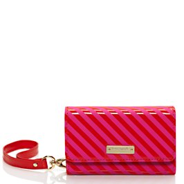
Kate Spade iPhone Wristlet -  Nice and bright for spring
Callet Phone Cover and Wallet - Great for just slipping your phone in your pocket with a couple of credit cards for a night out

Michael Kors iPhone Wristlet - Love this tangerine color 
Tori Burch "Robinson" iPhone Wallet - pricey but sooo pretty.


Mischief Managed

How cute would these Harry Potter themed prints be in a home office, library or children's room. I think the Dumbledore quote is my favorite, how about you?


Wallpaper at The Greenbrier

Jason and I got home from our trip to The Greenbrier yesterday. Eventually, I'll do a full post on the place. Even though we were there for a shoot, I loved it and I would definitely recommend it to anyone looking for a getaway.


For now, lets talk about the wallpaper. Some of it was crazy, but it did get me to think about possibly wallpapering some walls in my house. 


After World War Two, the entire resort was redecorated by Dorothy Draper, an interior designer very influential at the time and known for her "anti-minimal" style. She encouraged a generation of housewives to be their own decorators, experimenting with bold colors, patterns and Baroque designs. 


These wallpaper patterns were all over the place, one crazy pattern leading into the next. 


If I take any design tips from Dorothy Draper and my experience here, it will be to not be afraid to use bold colors and mix patterns. 


And now, we've come to the end. I'll leave you with this "fat lady" singing, a part of a hand painted wallpaper design in one of the Greenbrier's cafes. 


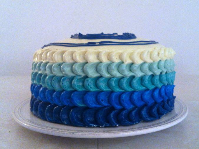
An Ombre Birthday Cake


Isn't this cake awesome?! Even the inside is ombre! Our friend Rosanna, who lives in LA, made it and we thought it was so cool we asked to put it up on the blog. 
Here's a little blurb from her on how it came about:
The cake was for my friend and surfing buddy's birthday. The design on the top of the cake is the logo for our surf club. If it had been less than 102 degrees in my house as I was frosting the cake, I perhaps could have drawn the logo better than a two year old, but as it was 102 degrees in my house, this will have to do : ) The cake is an almond cake, and the frosting is an Almond Swiss Buttercream frosting. Super tasty together. Yay for cakes inspired by the ocean!